XtoZ: Digital Consultancy Agency.
XtoZ is a Digital Consultancy Agency specialising in transforming businesses from Gen X to Gen Z models, allowing them to thrive in today’s fast-paced digital era.
Brand Overview.
As technology and digital innovations evolve, many companies face challenges in adopting new tools and strategies that drive growth. That’s where we come in.
We partner with businesses in all industries, supporting them in achieving a sustainable, successful, and long-term impact that allows them to adapt and grow.
Logo Design.
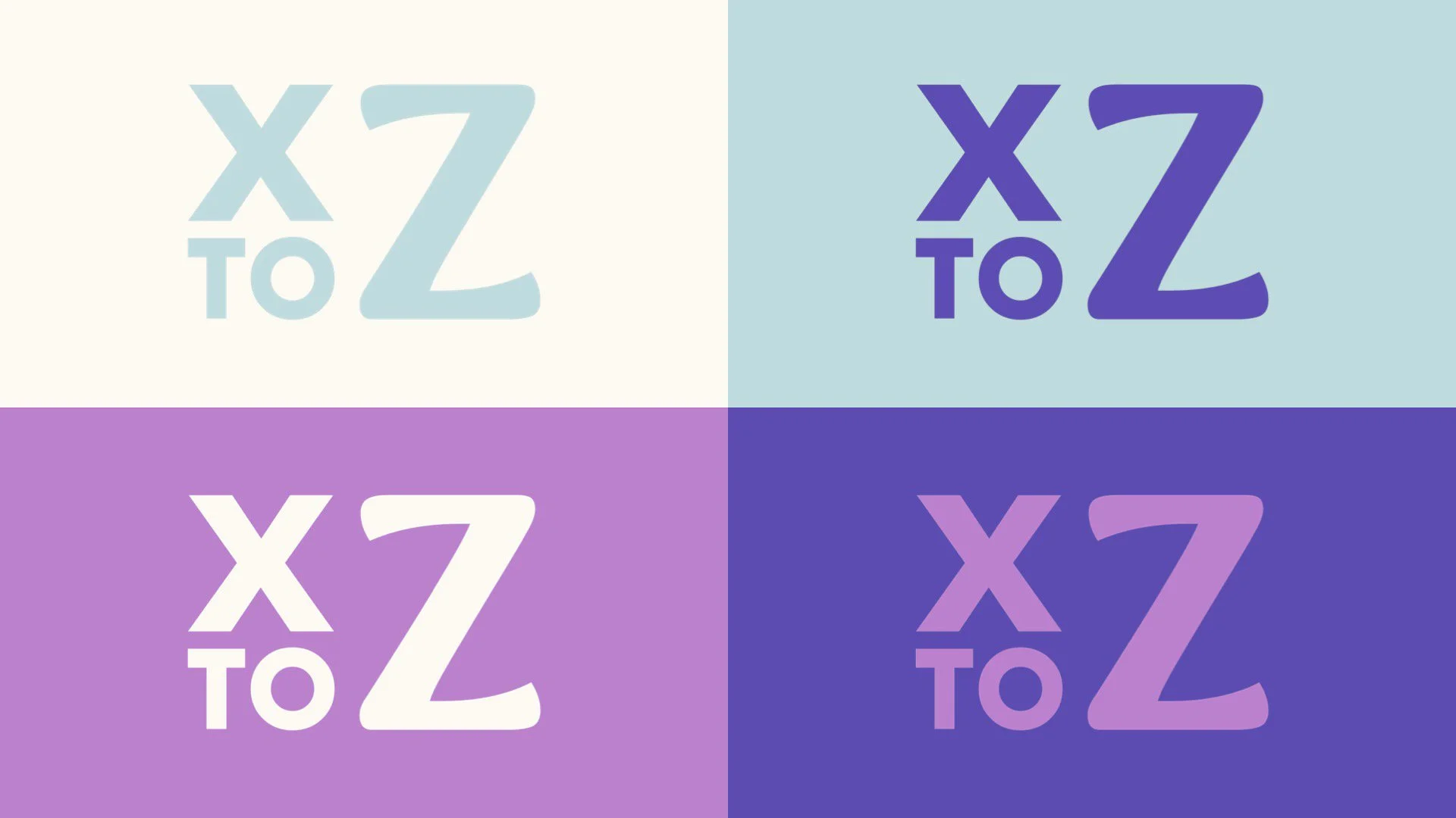
The logo is a bold and modern representation of the agency’s core mission: guiding businesses from Generation X to Generation Z in their digital transformation. The design balances strength and adaptability, reflecting XtoZ’s commitment to innovation, collaboration, and growth in the fast-paced digital era.
The logo maintains a clean, minimalist structure that ensures versatility across digital and print media, from social platforms to business presentations. It is designed to remain recognisable in both its primary and alternative variations, ensuring adaptability to different layouts and backgrounds.
The primary typeface, Syne Extra Bold, gives the logo a striking, contemporary look with high readability and impact. A modern and striking font that establishes confidence and authority, making the brand stand out in a competitive digital landscape.
Primary Typeface.
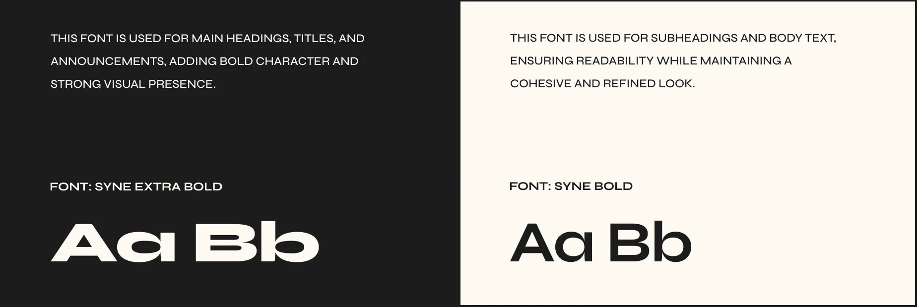
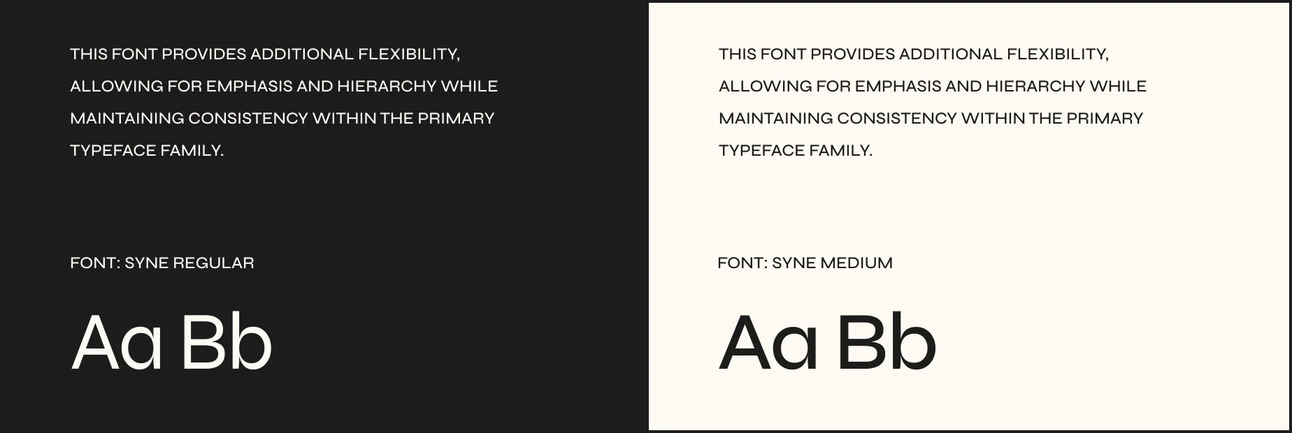
This choice conveys confidence and a forward-thinking mindset, essential for a consultancy that thrives on pushing digital boundaries.
Secondary Typeface.
The supporting typography, Montserrat Light and Montserrat Medium, introduces a sense of elegance and readability, complementing the boldness of the primary typeface. This balance ensures that while the brand remains strong and contemporary, it also feels professional, approachable, and structured.
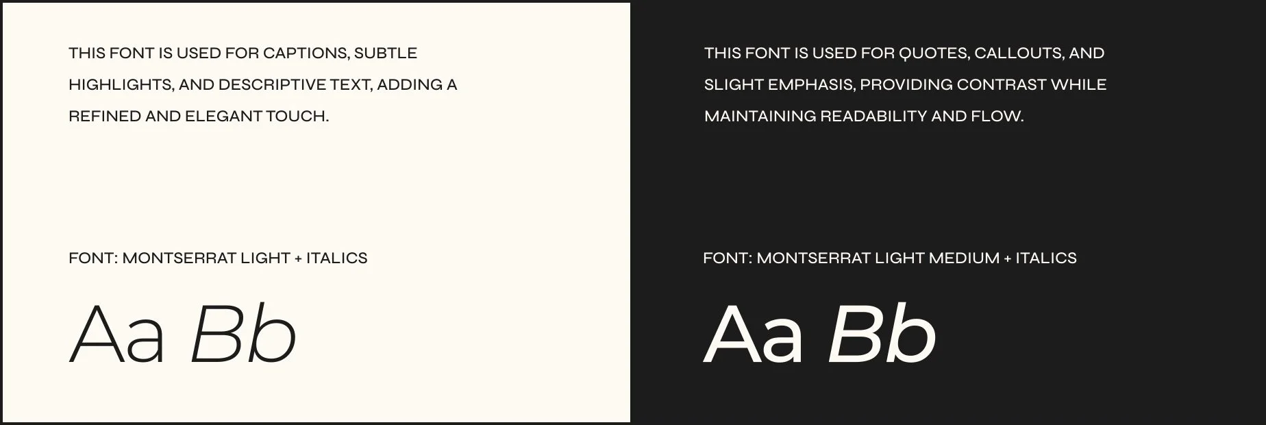
A blend of sophistication and dynamism, chosen to represent the fusion of traditional business models with modern digital strategies.
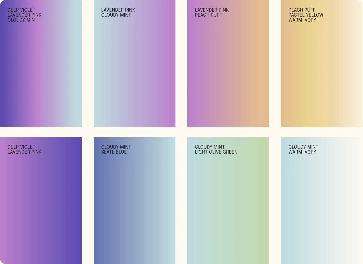
Colour Palette.
Primary.
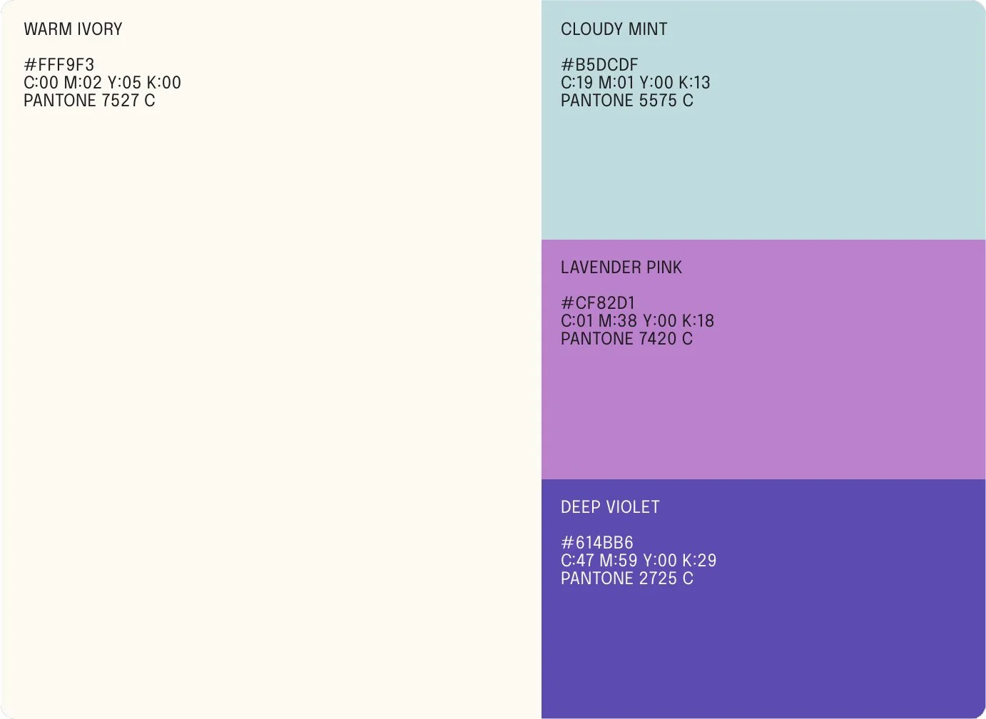
XtoZ’s primary colour palette embodies clarity, innovation, and authority, reflecting its role in digital transformation. Warm Ivory provides a neutral foundation for balance and readability, while Cloudy Mint introduces a fresh, adaptable tone. Lavender Pink injects bold creativity, making the brand feel modern and dynamic, while Deep Violet grounds the palette with a sense of expertise and trust. Together, these colours create a visually striking yet approachable identity.
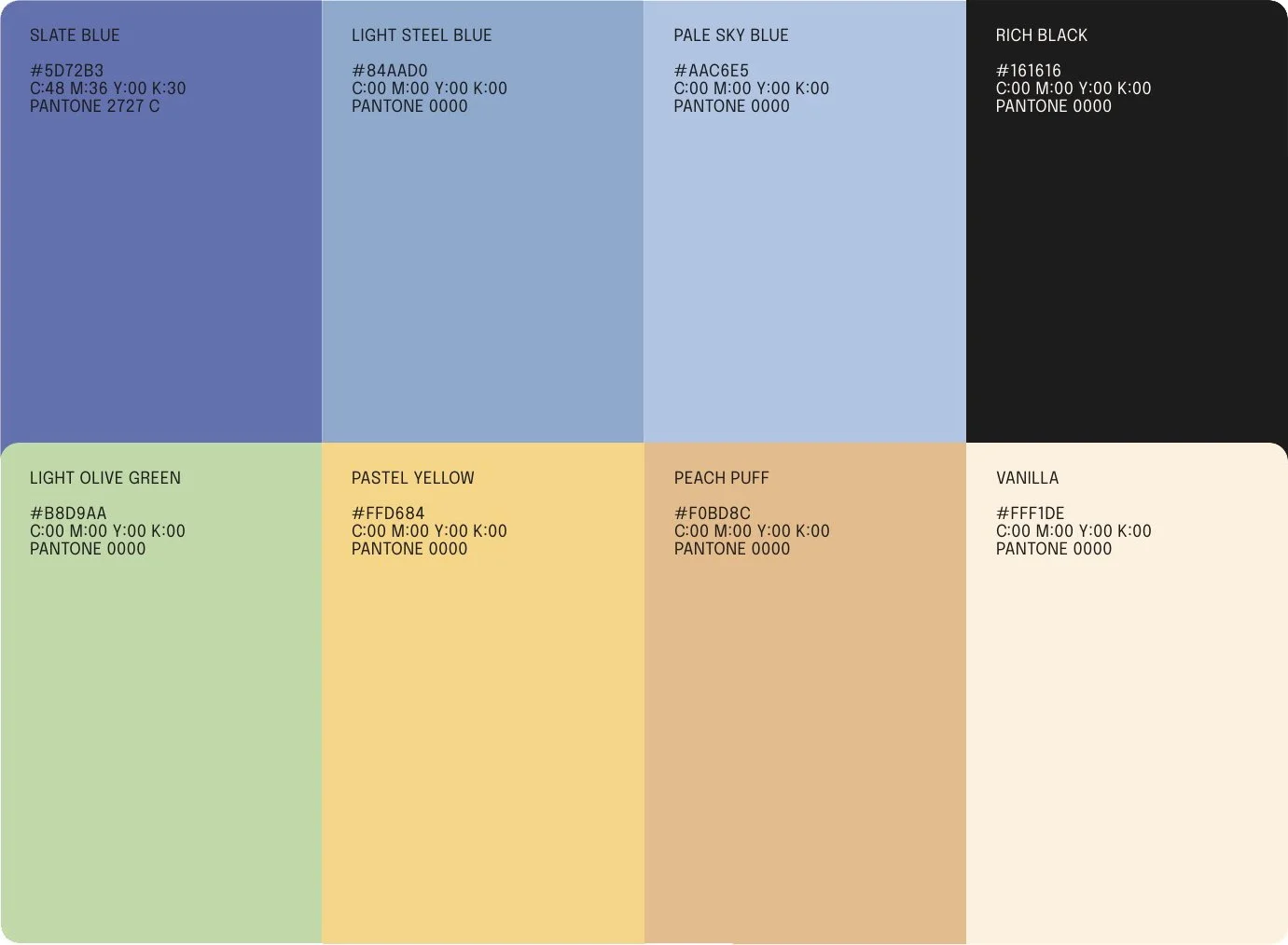
Extended.
The gradients add depth and fluidity to the brand, reinforcing its dynamic and transformative nature. Blends like Deep Violet to Lavender Pink and Cloudy Mint to Warm Ivory symbolise evolution and adaptability, mirroring the agency’s role in guiding businesses through digital change.
These smooth transitions create a sense of movement, making the brand feel forward-thinking and seamless across digital and print applications.
XtoZ’s graphic elements serve as dynamic visual anchors that strengthen brand consistency and engagement across various touchpoints.
Graphic Elements.
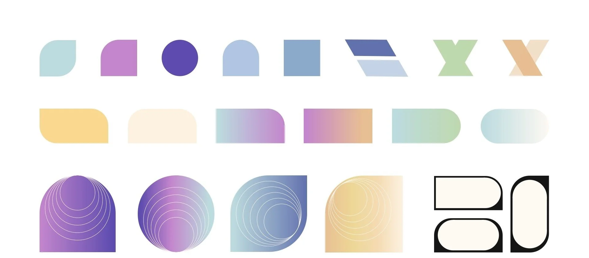
Abstract geometric forms, inspired by digital interfaces and transformation, function as text containers, callout elements, and speech bubbles, reinforcing key messages in a structured and visually appealing way. Layered, fluid shapes are used for backgrounds, overlays, and decorative accents, symbolising the seamless digital transition XtoZ enables for its clients. Meanwhile, dynamic line work guides the viewer’s eye, creating a sense of movement and digital progression that reflects the agency’s innovative approach.
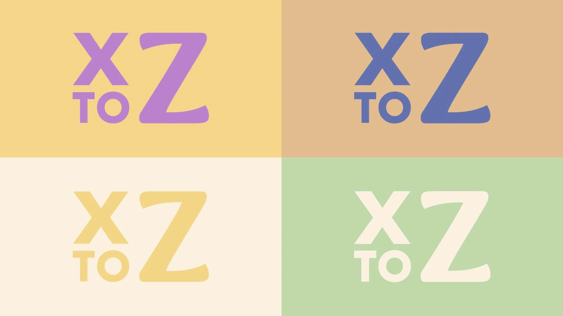
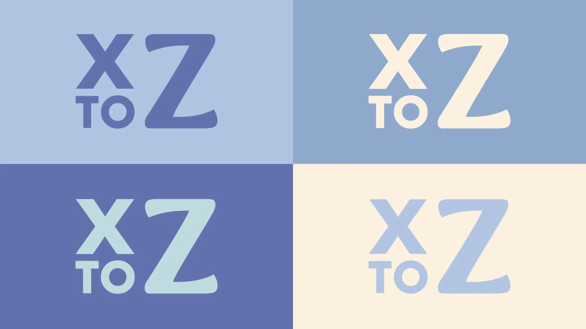
Logo in Colour.